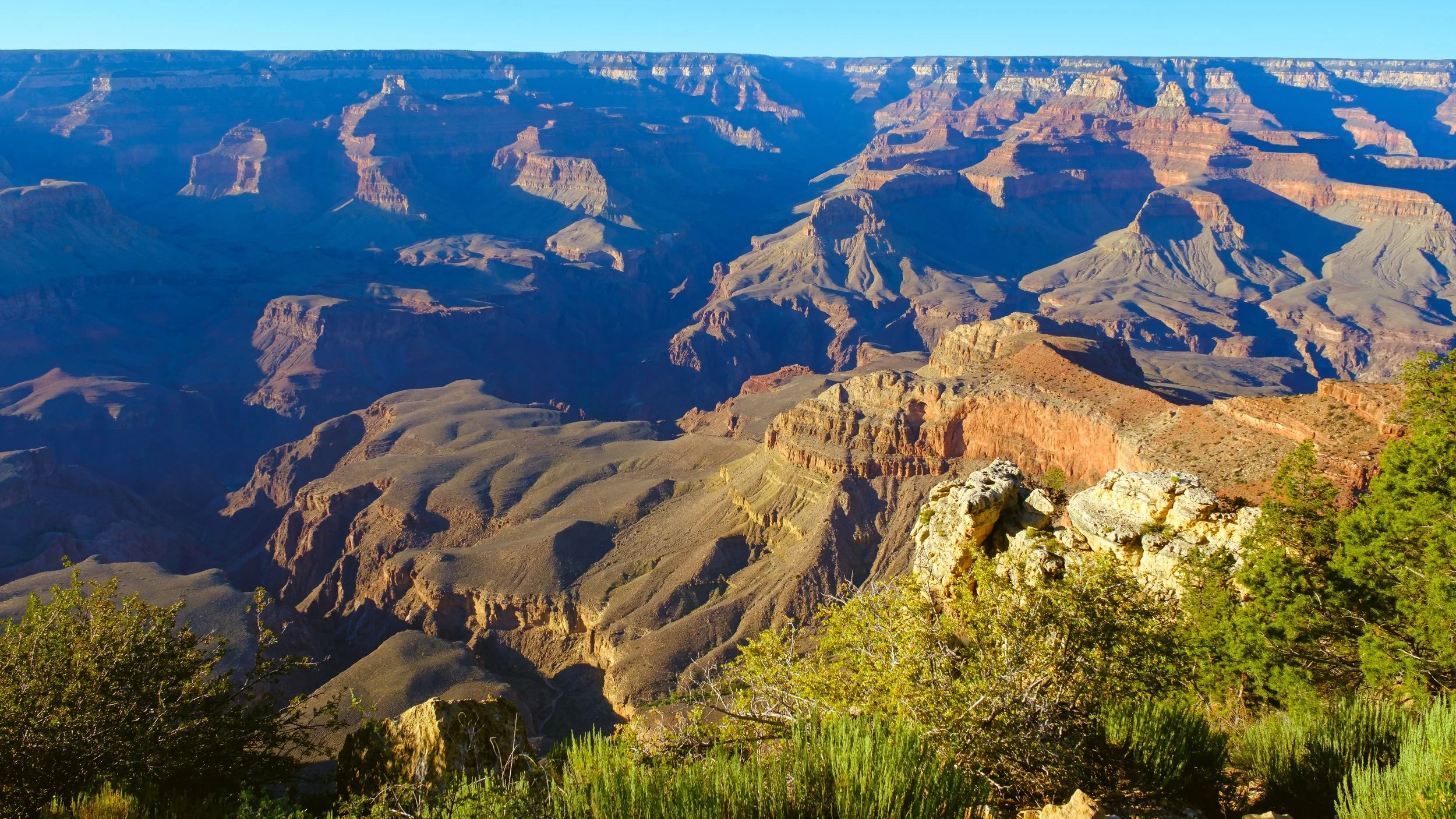
The Quiet Spell of Vintage Color Photography
There is a particular kind of color that feels less like decoration and more like memory.
It is the color of old family slides, roadside motels, desert postcards, mid-century travel films, faded National Geographic pages, and motion pictures made before digital sharpness taught every surface to announce itself. It is not always accurate in the modern technical sense. Skies may lean cyan. Shadows may carry green. Skin, stone, dust, and evening light may warm toward amber. Blacks may lift instead of falling into perfect darkness. Highlights may bloom a little at the edge, as if light itself has softened before reaching the eye.
And yet, for all its imperfection, vintage color often feels true.
Not true as measurement. True as recollection. True as atmosphere. True as the way a place lingers after we leave it.
This is the quiet spell of vintage color photography: it does not simply show what was in front of the lens. It suggests what it felt like to stand there.
Color Before Cleanliness
Modern digital photography can be astonishingly precise. The files are clean. The lenses are sharp. The sensors are capable of holding detail in shadows and highlights with almost clinical control. This is a gift, especially for landscape and nature work, where light can be difficult and fleeting.
But precision is not the same as presence.
Older color photographs often have a more limited language. Their palettes are narrower. Their greens are not aggressively green. Their blues are sometimes softened by haze. Reds and yellows carry weight. Earth tones matter. Grain lives in the image like weather. The photograph does not feel scrubbed or polished. It feels received.
That is part of the appeal. Vintage color photography reminds us that an image does not need to be perfect to be alive. In fact, its small imperfections often create the sense of life: the unevenness of grain, the roll-off of highlights, the slight color shifts that make time visible.
A digital file can sometimes feel as if it has no age. Vintage color has age built into it. Even when newly made, it seems to arrive with a past.
The Color of Memory
Memory does not preserve the world evenly.
Some things sharpen. Others fade. A doorway may remain clear while the rest of the street softens. The color of late afternoon may grow warmer in recollection. A desert ridge may become less a geological form than a feeling of distance. A single flower against an old wall may become brighter than it was, not because the mind is dishonest, but because attention gave it meaning.
Vintage color photography has a similar structure. It often reduces the literal and strengthens the emotional.
This is why the look remains so powerful. It does not merely imitate old film stocks or faded prints. At its best, it imitates the behavior of memory itself.
The lifted blacks allow shadow to remain open, like a detail half-remembered. The warm highlights suggest time, sun, paper, and age. The muted saturation prevents the image from shouting. Grain interrupts the illusion of perfect transparency and reminds us that every photograph is a translation, not a possession.
That is important. A photograph is not the place itself. It is a witness to a moment of contact between light, land, and attention.
The Beauty of Restraint
The danger in chasing a vintage look is overstatement.
It is easy to make the image too yellow, too faded, too grainy, too sentimental. The photograph becomes costume instead of experience. It begins to point at its own effect rather than back toward the world.
The better path is restraint.
A vintage color treatment should feel as if it emerged from the light already present in the scene. It should clarify, not decorate. It should make the photograph quieter, not louder. The goal is not to make a modern file pretend to be old. The goal is to recover some of the patience and tonal humility that older color processes often carried naturally.
For nature and landscape photography, this matters especially. The land does not need theatrical enhancement. It needs attention. The work is to simplify the palette, preserve the dignity of the light, and allow the subject to breathe.
A desert scene may need only a slight warming of the highlights, a reduction in electric greens, a gentler black point, and fine grain. A woodland image may need cooler shadows, softened contrast, and a little glow where light catches leaves or water. An old structure in a natural setting may benefit from earth tones, muted color, and a touch of atmosphere.
The edit should feel discovered rather than imposed.
Grain as Texture, Not Noise
Digital noise is usually something we try to remove. Film grain is different. Grain gives the image a surface.
It reminds the viewer that the photograph is an object, not just a window. It creates a tactile quality. It softens transitions. It gives skies, walls, shadows, and skin a subtle pulse. In older color photographs, grain is part of the emotional architecture of the image.
But grain must be handled carefully. Too much, and it becomes nostalgia as decoration. Too little, and the image may remain too clean, too glassy, too modern.
The best grain feels almost environmental. It belongs to the air. It sits across the image evenly, binding sky, stone, plant, and shadow into the same visual world. It is not there to call attention to itself. It is there to keep the photograph from becoming sterile.
Light That Breathes
One of the most beautiful qualities of older color photography is the way light behaves.
Highlights often have softness at the edge. Bright areas may bloom gently rather than cut sharply into the frame. Shadows are not always emptied of detail. There is a sense of exposure as an act of compromise. The image accepts limits.
This acceptance is part of the charm.
Contemporary editing often tries to recover everything: every highlight, every shadow, every texture, every color. Vintage color reminds us that not everything needs to be recovered. Some things can fall away. Some edges can soften. Some areas can remain quiet.
A photograph gains strength when it knows what to leave alone.
In the field, this means looking for light that already carries mood: late afternoon, open shade, desert haze, overcast skies, window light, backlight, dust, mist, or the last low sun on stone. The vintage color look begins before editing. It begins when the photographer notices that the world has already arranged itself into tone, color, and feeling.
Why It Still Matters
Vintage color photography endures because it offers an alternative to the frictionless clarity of the present.
It asks less of spectacle and more of atmosphere. It values suggestion. It allows quiet subjects to remain quiet. It gives room to ordinary places: a road, a ridge, a chair in golden light, a bridge crossing a small stream, a flower standing against weathered stone.
It also restores humility to the photograph. The image does not conquer the scene. It does not explain everything. It simply bears witness.
For my own work, this is where the vintage color sensibility feels most useful. Not as imitation, but as discipline. It encourages me to reduce rather than embellish, to honor the light that was given, to let color carry memory without overwhelming reality.
The best vintage color images seem to say: this happened, briefly, in this light, and it was enough.
That is the feeling worth preserving.

The Discipline of Quiet Seeing
In the end, the most meaningful photographs often come from a moment when the photographer stops trying to control the scene and instead listens to it.
A few minutes of quiet reflection can transform a hurried encounter with the landscape into something more thoughtful and deliberate.
Landscape photography often appears spontaneous from the outside. A viewer may imagine the photographer arriving at a location, raising the camera, and quickly capturing what lies before them. In practice, the most meaningful photographs tend to emerge from the opposite process: restraint, patience, and quiet reflection before the shutter is ever pressed.
Photography begins not with the camera, but with attention.
Standing Still
When I arrive at a scene, the most important decision is usually to do nothing at all.
It is tempting to immediately begin composing frames. Yet the landscape has its own rhythm that reveals itself slowly. Wind moves through grasses. Light shifts across stone. Shadows lengthen and soften as clouds pass overhead.
If the photographer moves too quickly, these quiet forces remain invisible.
Standing still allows the scene to unfold. Patterns emerge. The mind becomes less focused on “getting the shot” and more attentive to the relationships already present: light against texture, scale against distance, movement against stillness.
This moment of waiting is not inactivity. It is the beginning of seeing.
The Shape of a Place
Every location carries a structure that is not immediately obvious. A canyon may appear chaotic at first glance, yet after a few minutes the repeating ridges begin to reveal their rhythm. A forest floor that seemed cluttered begins to separate into lines of light and shadow.
This is the difference between looking and observing.
Observation involves asking quiet questions:
Where is the light actually moving?
Which forms repeat, and which interrupt the pattern?
Where does the eye naturally come to rest?
Often the strongest photograph emerges when the photographer recognizes the underlying order of the landscape rather than imposing a composition upon it.
Nature rarely needs embellishment. It simply asks to be noticed.
The Photographer as Participant
Quiet reflection also changes the role of the photographer.
Photography can sometimes become an act of acquisition. The language of “capturing” or “taking” images reinforces the idea that the landscape is an object to be collected. A slower approach reframes the process.
The camera becomes an instrument of attention rather than possession. Each frame becomes a small acknowledgment that the moment existed.
In this sense, photography is less about mastery of the environment and more about relationship with it. The photographer stands within the scene, not above it.
My own work grows from this perspective. I try to approach each image as an act of gratitude rather than control. A photograph can never hold the fullness of what is before us, but it can bear witness to the moment in which we stood there and saw it. Working Artist Statement
Recognizing the Photograph
A curious thing happens when we allow the landscape time to speak.
Eventually the photograph becomes obvious.
It might be the way a single figure appears against a massive ridge, giving the land a sense of scale. It might be a small detail: a flower against an old wall, a bridge crossing a quiet stream that carries a story larger than itself.
The key insight is that the photograph is usually already present in the scene. The task of the photographer is not to invent it, but to recognize it.
This recognition often happens only after the mind has slowed down enough to notice what was always there.
Why Stillness Matters
In an era of constant image production, quiet reflection may seem inefficient. Yet it is precisely this pause that separates a meaningful photograph from a merely competent one.
Stillness allows the photographer to:
See relationships rather than isolated objects
Notice subtle changes in light and atmosphere
Recognize patterns that give a scene structure
Respond to the emotional tone of a place
Without this pause, the photograph risks becoming just another image. With it, the image begins to carry something deeper: presence.
The Practice of Returning
One of the simplest ways to cultivate this kind of seeing is to return to the same place more than once.
The first visit reveals the obvious features of a landscape. The second begins to reveal its patterns. By the third or fourth visit, the photographer often starts to understand the quieter moods of the place: the direction of morning light, the stillness before sunset, the textures that emerge after rain.
Photography then becomes less about searching for scenes and more about deepening a relationship with them.
A Quiet Thank You
In the end, the most meaningful photographs often come from a moment when the photographer stops trying to control the scene and instead listens to it.
A few minutes of quiet reflection can transform a hurried encounter with the landscape into something more thoughtful and deliberate.
The shutter eventually clicks, but by that point the photograph has already taken shape in the mind.
The image becomes less an act of creation and more a small gesture of thanks for the light, for the place, and for the simple privilege of seeing it.

The Beauty of Color in Photography
Why do we like the fiery colors of a sunset? Or my favorite, the pastel pink of the clouds in the blue hour? Especially against a soft blue sky. My hunch has always been that it is evolutionary.
Why do we like the fiery colors of a sunset? Or my favorite, the pastel pink of the clouds in the blue hour? Especially against a soft blue sky. My hunch has always been that it is evolutionary. There has to be some built in relax factor to see a calm blue sky with harmless white puffy clouds towering over fields of green. I can get that. Gold and brown hues confuse me a little though. It seems we would shy away from them as they represent arid, scarce environments. It does make sense to me that people don’t always gravitate towards desert type views. But why then do some (like myself) absolutely adore them? These are definitely ideas I like to explore in photography.
I’m a big fan of taking pictures of chaparral. An ecosystem found in Mediterranean climates like Southern California. It’s actually my practice grounds. I love the challenge of making beautiful images out of scenes many find pedestrian at best, ugly at worst. But, even though I like the natural flora of Southern California, I still find it difficult to capture pleasing images that are also true to the form of the plants I’m photographing. That is to say not using them for some sort of abstract look. Or, I’m also guilty of pulling in dramatic skies any chance I get, cheating the emotional response by adding in a reaction to the sublime.
The reason for my trouble is that chaparral plants are largely a dirty green, rusty red and brown. The soft pastel greens that so many are drawn to don’t exist in this environment. Other bright, eye-catching colors are hard to come by even in wildflower season. It’s an acquired taste for color palette of the chaparral. The desert, as monotonous and dry as it may seem at first glance, has an incredible array of color, especially in spring. Rare is the occasion where you can find wildflowers carpeting vast swaths of land, but they are there every year if you get out of the car and take a look. Brilliantly colored wildflowers tug at our most ancient impulses towards nature’s hues. You can easily find photographic compositions with complementary colors, and with a little work maybe even some advanced color theory like triadic or split complementary combinations.
Landscape photographers do most of their work during the golden hour- that time just after sunrise of just before sunset. The soft gold light illuminating a scene from the side makes for the most popular color images. I don’t disagree that that’s the best time for landscape photography but I do think there’s much to explore in any lighting under any conditions. Take the time to study the color wheel, color theory, and see what you can combinations you can compose in a scene. Learn a little but about the psychology of color as well. Do you want an excitable response (think reds and yellows), or a subdued one (blues, greens, and pastels)? There are infinite opportunities for you to create the imagery you want. Go out and do it.

The Yucca Man
The legend of the Yucca Man, often referred to as "California’s Bigfoot," is a chilling tale that has circulated among locals in the desert regions of Southern California for decades. Sightings of the creature are most commonly reported near Joshua Tree National Park and the expansive Mojave Desert. Described as a towering, ape-like figure with shaggy, dark hair, the Yucca Man is said to emit an overwhelming, foul odor. Unlike its northern cousin, Bigfoot, the Yucca Man is often characterized as more aggressive, with glowing eyes that pierce through the desert night.
The origins of the legend are unclear, but stories gained traction in the 1970s when Marines stationed at the Twentynine Palms military base began reporting unsettling encounters. Guards on night patrols claimed to see a massive humanoid figure lurking near the base perimeter, moving with unsettling speed and agility. Some accounts even suggest that the Yucca Man would rattle fences and emit guttural growls, sending shivers through the desert silence.
While skeptics attribute the sightings to misidentified animals or desert mirages, the stories persist, adding an eerie layer to the vast, desolate landscape. For many, the Yucca Man serves as a cautionary tale, a reminder of the mysteries that may still dwell in the uncharted corners of the Californian desert.

What’s in a photograph?
Is it merely the record of an event that happened to occur in front of the camera? Is it an expression of the photographer’s vision, or more so, the interpretation of the viewer?
What’s in a photograph?
Is it merely the record of an event that happened to occur in front of the camera? Is it an expression of the photographer’s vision, or more so, the interpretation of the viewer?
Where does its value lie?
In the intent of the photographer, the craft of the image, or the attractiveness to the consumer?
The answer to these two questions is probably all of the above. I think though at its deepest level the answer is the information in the photograph. Something occurred in the mind of the photographer that compelled them to take a picture and then massage its traits so as to best represent the feeling that photographer had just before the moment of capture. The information describing that feeling is wrapped up in the fundamental building blocks of the image and delivered to the viewer so that they may share in that feeling.
There are problems with this transfer however. Despite the inarticulate nature of visuals as a pure conduit of emotion, I think the bigger challenge is actually in the differing life experiences of the photographer and the viewer. The environmental conditions that trigger an emotional response in one person do not always do the same to another. So, even if the message is pure, the intended emotional impact may not be there.
What I think this ultimately means is that the value of the photograph is registered in the viewer. Now, the photographer is a viewer too and “gets it” better than anyone. But, for any given photograph to impact a wide number of people it has to speak in a language common to most people. That’s a double-edged sword. Qualities that appeal to the masses aren’t bad, but crafting imagery to meet this appeal leads to prosaic, cookie-cutter work. Individuality must be measured. Too much and nobody gets it. Too little and everybody gets bored.

Are my photographs art?
I know in the strictest sense yes, they are works created by a human. But, that’s not what I mean. I’m thinking in more normative or comparative terms. Do my photographs stand as worthy examples of art and culture the way others’ works do?
I know in the strictest sense yes, they are works created by a human. But, that’s not what I mean. I’m thinking in more normative or comparative terms. Do my photographs stand as worthy examples of art and culture the way others’ works do?
I don’t know. I have always felt this sense of inadequacy when it came to taking pictures. Mostly because the act of taking a picture- pressing the shutter button, seems so easy when put up against the skill of painting or musicianship. Yes, I have taken tens of thousands of pictures, edited thousands of them with sophisticated and complicated software, and spent countless hours studying both the technical and philosophical aspects of the medium. Still I have this sense that it’s not enough.
I think photography is art in a general sense, but when it comes to me specifically, am I there yet? I like my pictures and so do most others that see them. But, I have this nagging worry that that doesn’t scale. Only one of my images has ever gone “viral” and I could not tell you why. It was just a phone shot I was sending to show a friend where I was. It was a sunset picture and happened to look cool so I posted it on Twitter. It ended up getting over 200 shares, over 1,000 likes, and over 60,000 views. Not one extra follower though. If social media proof is the currency in which artistic value is measured, I have fallen painfully short time after time. Do likes equal quality?
In my other blog post, “What’s in a Photograph?” I look at the question of value in the picture. I do think the viewer makes the final assessment on that, but it’s very personalized. A wider audience demands wider appeal and therefore more simple elements. It’s a delicate balance the artist must make in order to receive wide approval. Be different enough to stand above the noise while retaining the traits of that noise.
One final wrinkle. Is a photograph art because the work in itself is so, or because the creator is an artist? We should all hope it’s the former, but when it comes to value (definitely economically) it seems to sit firmly on the side of the creator. A well-known artist creates a work- art. An unknown person creates a work- hmm? That’s not to say there isn’t a lot to being established as an artist. Of course there is. But isn’t being creative core to the human experience? Isn't real art, and real art that has value in people’s lives, far more prevalent than we give ourselves credit for?

Editing photographs
Editing photographs comes with baggage. Though it's been happening from the start, mainly in darkrooms, digital tools like Photoshop have brought up questions of accuracy, authenticity, and expression in the modern photography scene.
Editing photographs comes with baggage. Though it's been happening from the start, mainly in darkrooms, digital tools like Photoshop have brought up questions of accuracy, authenticity, and expression in the modern photography scene.
I fall squarely on one side. Do whatever you want! That is to say, if you are creating art then do so. The way in which the sensor detected light waves and the processor drew out an image should not lock you into the final work. Yes, photography as a documentary record should strive for truth in representation, but outside of that just go for it. (I know that sentence could use some unpacking, but that’s not my goal here.)
In my Substratum project I am taking editing further than I have done before. Beyond my typical exposure adjustments and color grading, I have split the image between its form and its color, simplifying them to a more pure state and recombining them in a way that gives an illusion of depth. Beyond simply liking it, I think it helps me understand how I bridge the real and digital worlds. I don’t create native digital art but love Photoshop and Lightroom. I have always tried manipulating my pictures in myriad ways and over time have found myself “toning it down” if you will.
It seems to be a common trope in life that as we age we “pull it back” a bit and stabilize ourselves in all that we do. We aren’t as energetic and playful as children. We moderate our engagement in activities of all types (read between the lines). Art usually follows a similar pattern. As we refine our technique, we hone our craft through the shaving of excess. However, even moderation should be done in moderation.
That is what my current project is about in part: pushing past the self-imposed limits I have developed in editing my pictures. I used more contrast than usual. I used more vibrant colors than usual. I ramped up the Gaussian blur more than usual. I know the charge that this could be simply done to satisfy the popular commercial palette for imagery, but it's not why I did it. I wanted to venture into the unknown, the uncomfortable, and see where it could take me.